Matplotlib#
Python 2D plotting library which produces figures in many formats and interactive environments.
Tries to make easy things easy and hard things possible.
You can generate plots, histograms, power spectra, bar charts, errorcharts, scatterplots, etc., with just a few lines of code.
Check the Matplotlib gallery.
For simple plotting the pyplot module provides a MATLAB-like interface, particularly when combined with IPython.
Matplotlib provides a set of functions familiar to MATLAB users.
In this notebook we use some numpy command that will be explain more precisely later.
Line Plots#
np.linspace(0,1,10)return 10 evenly spaced values over \([0,1]\).
%matplotlib inline
# inline can be replaced by notebook to get interactive plots
import numpy as np
import matplotlib.pyplot as plt

%config InlineBackend.figure_format = "retina"
plt.rcParams['figure.figsize'] = (10.0, 6.0) # set figures display bigger
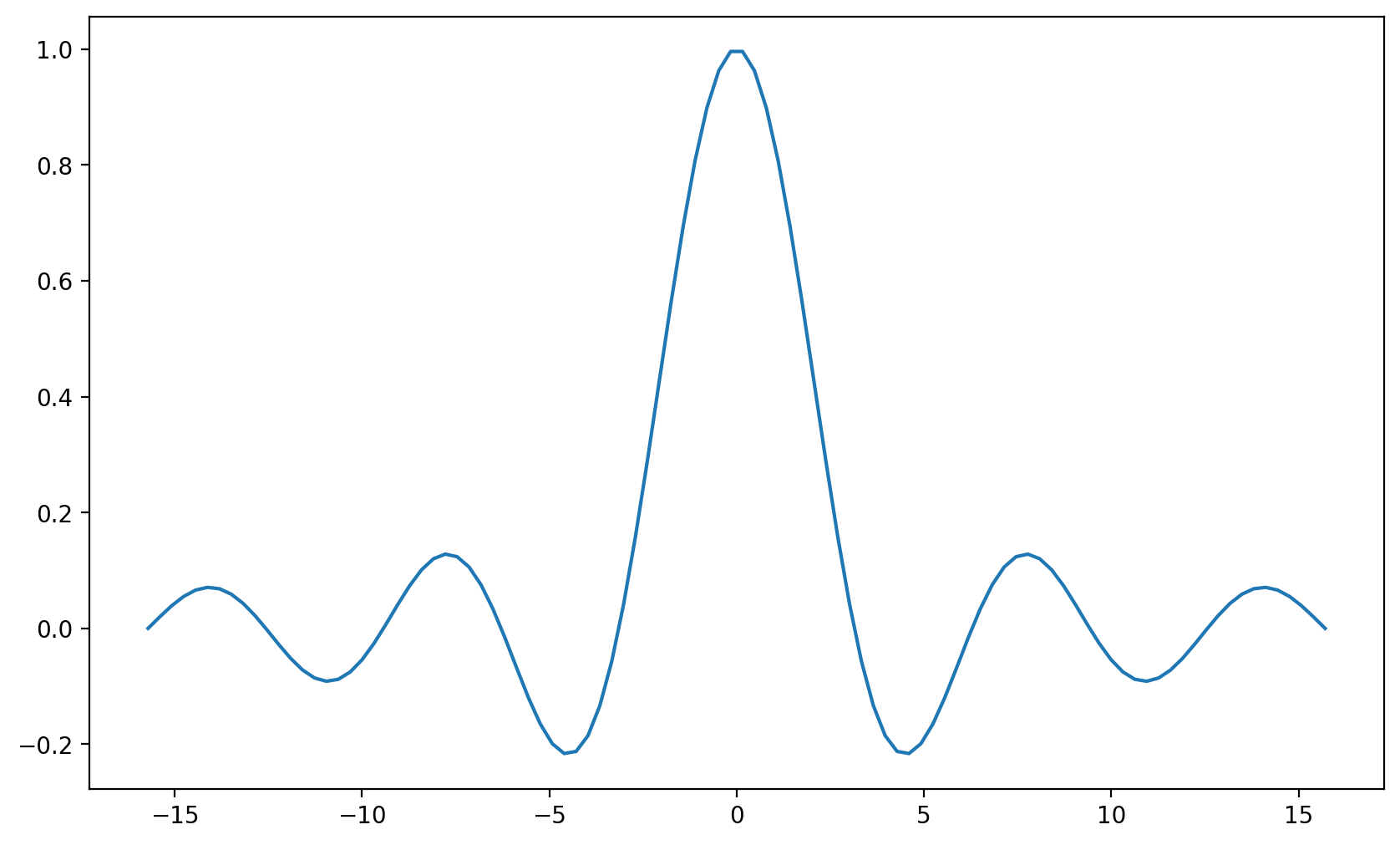
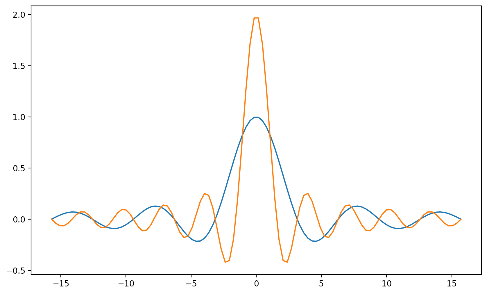
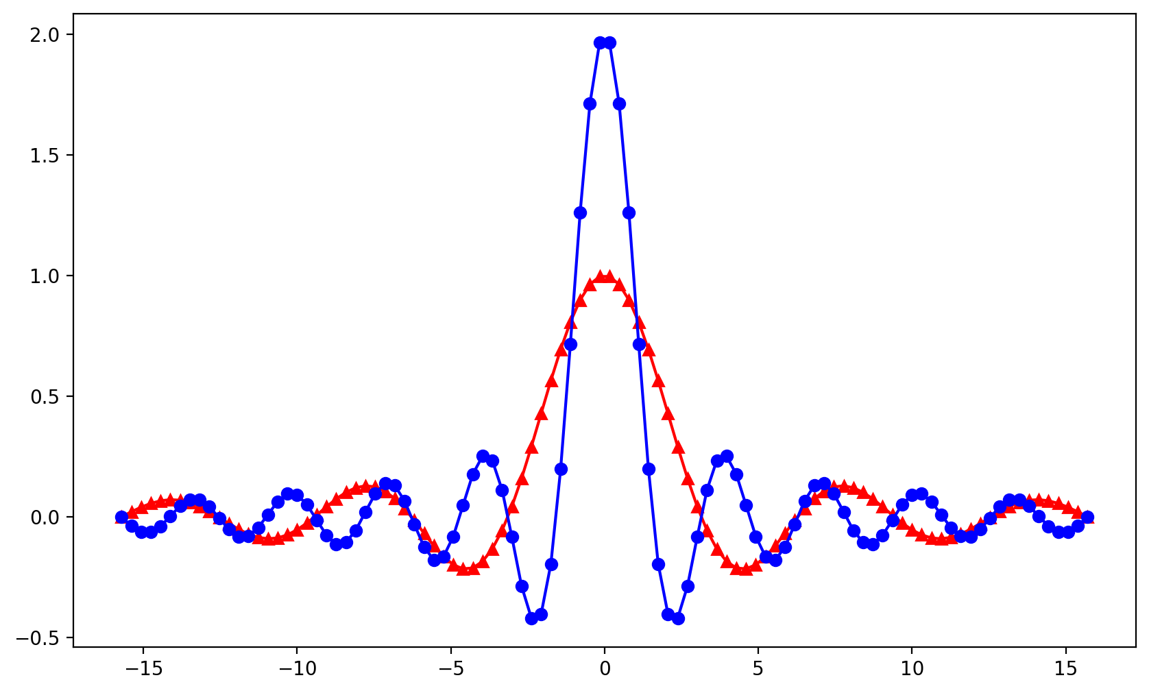
x = np.linspace(- 5*np.pi,5*np.pi,100)
plt.plot(x,np.sin(x)/x);
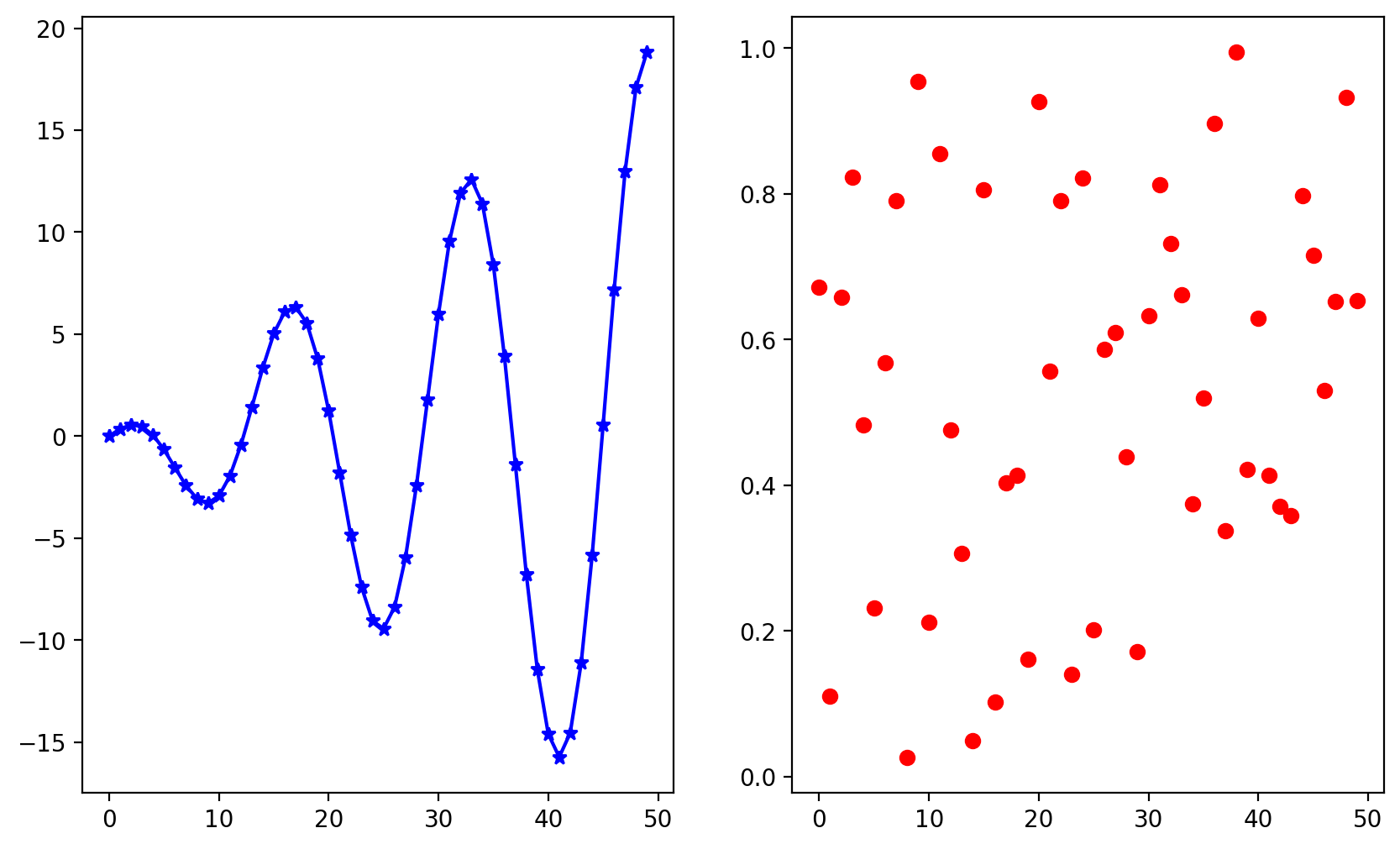
plt.plot(x,np.sin(x)/x,x,np.sin(2*x)/x);
If you have a recent Macbook with a Retina screen, you can display high-resolution plot outputs. Running the next cell will give you double resolution plot output for Retina screens.
Note: the example below won’t render on non-retina screens
%config InlineBackend.figure_format = 'retina'
# red, dot-dash, triangles and blue, dot-dash, bullet
plt.plot(x,np.sin(x)/x, 'r-^',x,np.sin(2*x)/x, 'b-o');
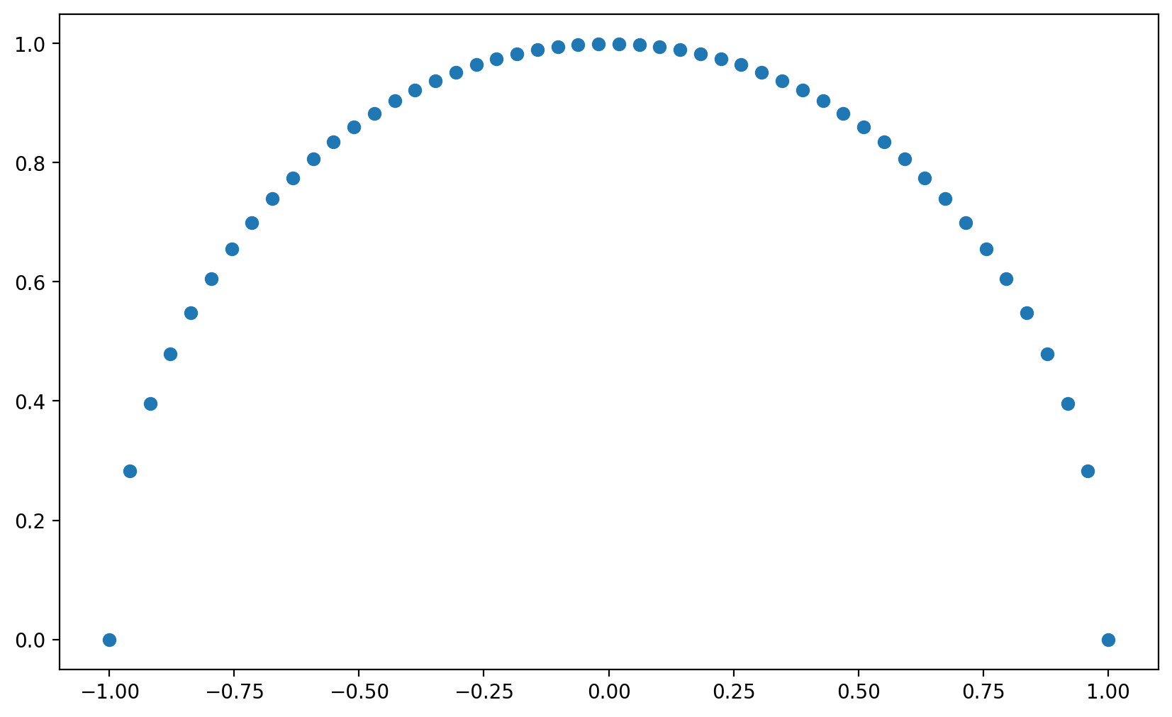
Simple Scatter Plot#
x = np.linspace(-1,1,50)
y = np.sqrt(1-x**2)
plt.scatter(x,y);
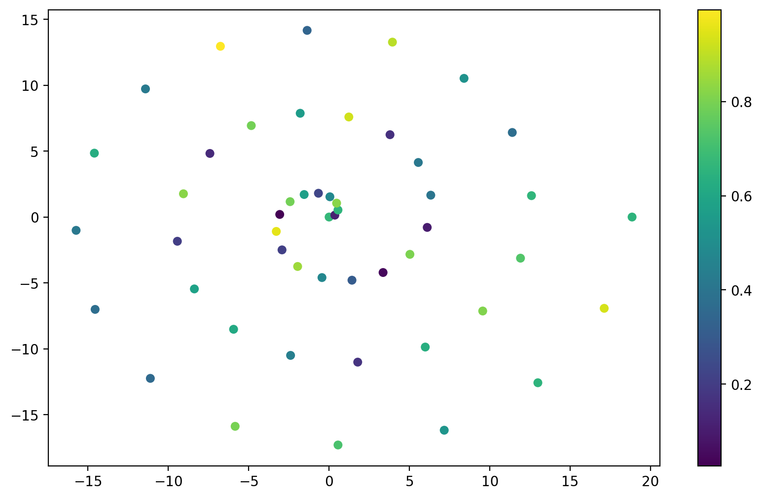
Colormapped Scatter Plot#
theta = np.linspace(0,6*np.pi,50) # 50 steps from 0 to 6 PI
size = 30*np.ones(50) # array with 50 values set to 30
z = np.random.rand(50) # array with 50 random values in [0,1]
x = theta*np.cos(theta)
y = theta*np.sin(theta)
plt.scatter(x,y,size,z)
plt.colorbar();
Change Colormap#
fig = plt.figure() # create a figure
ax = fig.add_subplot(1, 1, 1) # add a single plot
ax.scatter(x,y,size,z,cmap='jet');
ax.set_aspect('equal', 'datalim')
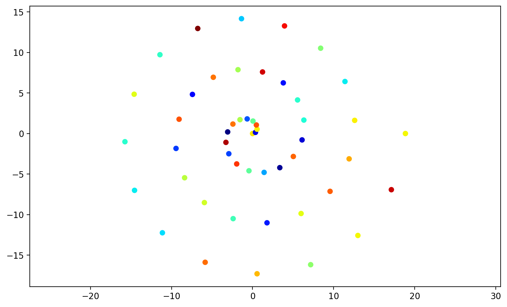
colormaps in matplotlib documentation.
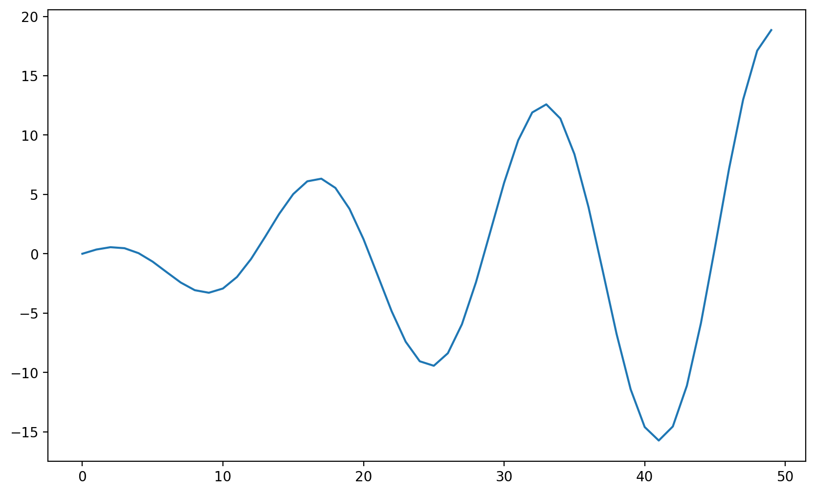
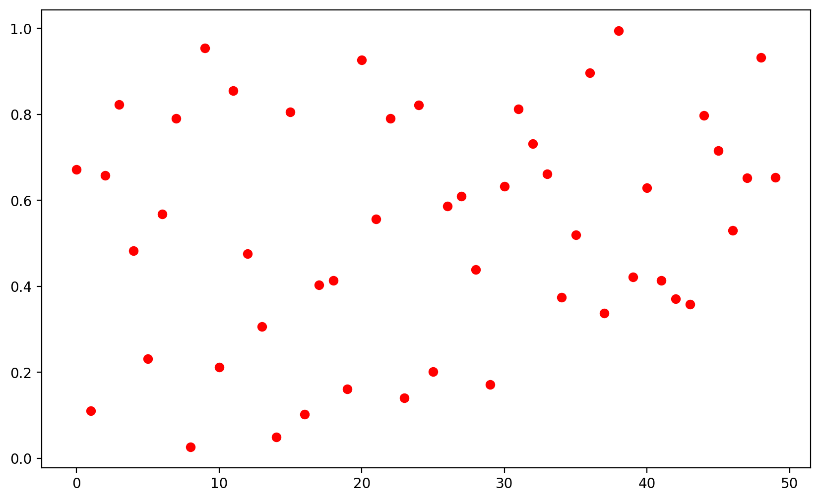
Multiple Figures#
plt.figure()
plt.plot(x)
plt.figure()
plt.plot(z,'ro');
Multiple Plots Using subplot#
plt.subplot(1,2,1) # 1 row 1, 2 columns, active plot number 1
plt.plot(x,'b-*')
plt.subplot(1,2,2) # 1 row 1, 2 columns, active plot number 2
plt.plot(z,'ro');
Legends#
Legends labels with plot
theta =np.linspace(0,4*np.pi,200)
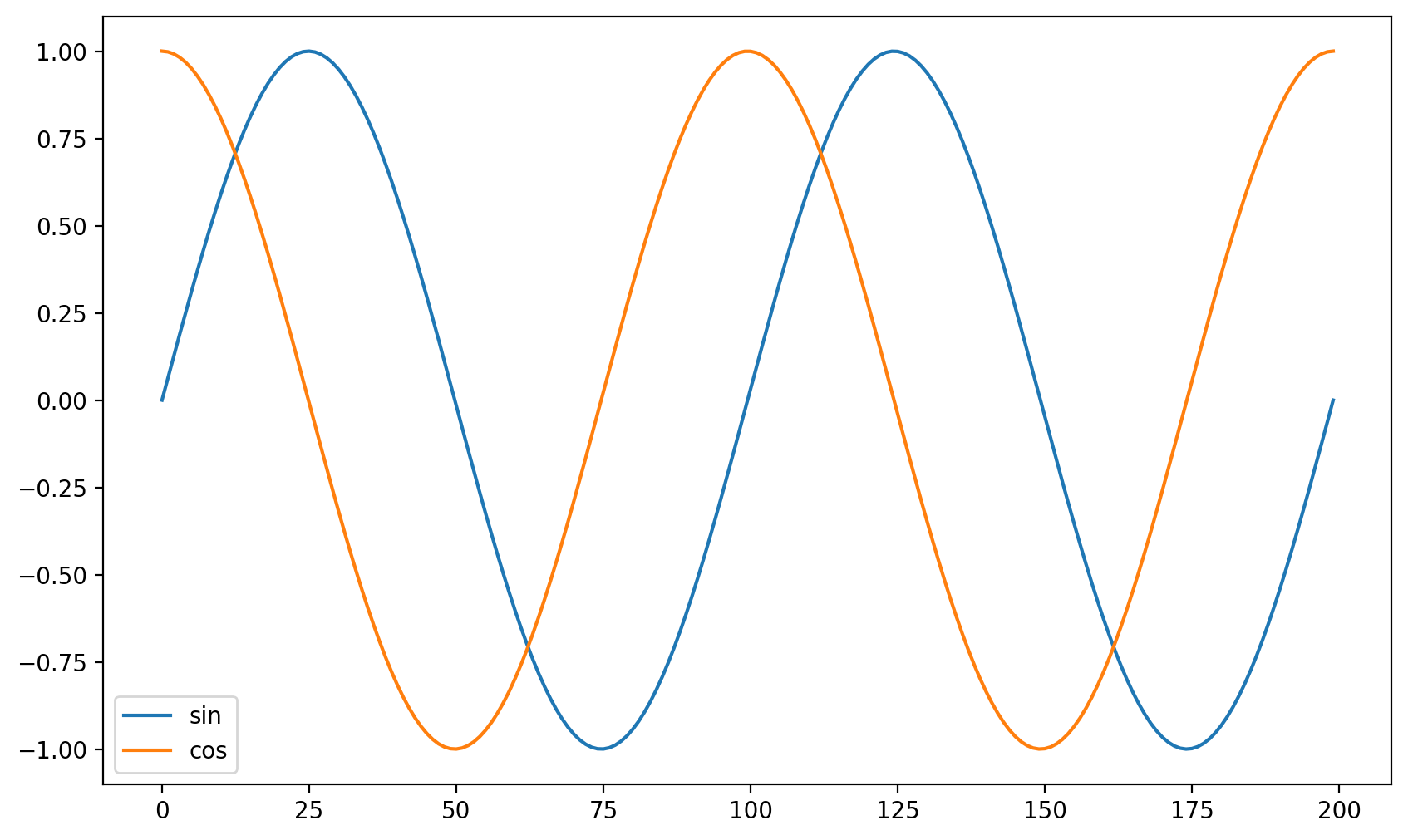
plt.plot(np.sin(theta), label='sin')
plt.plot(np.cos(theta), label='cos')
plt.legend();
Labelling with
legend
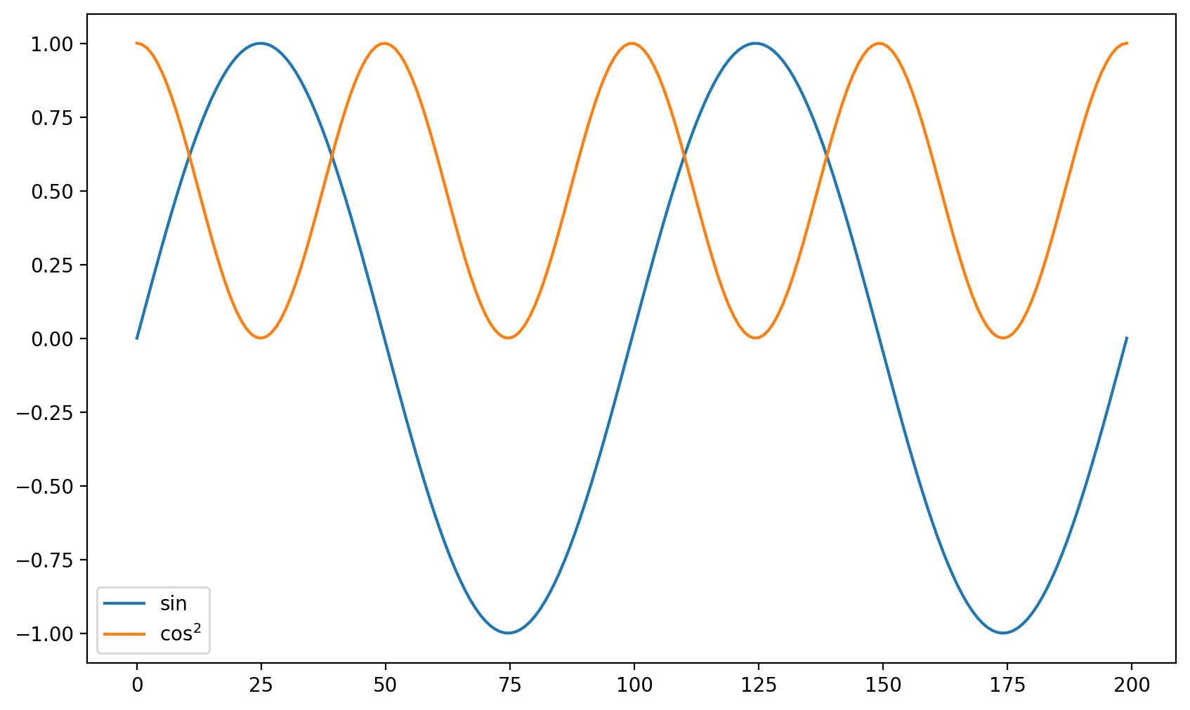
plt.plot(np.sin(theta))
plt.plot(np.cos(theta)**2)
plt.legend(['sin','$\cos^2$']);
<>:3: SyntaxWarning: invalid escape sequence '\c'
<>:3: SyntaxWarning: invalid escape sequence '\c'
/tmp/ipykernel_7717/3878772437.py:3: SyntaxWarning: invalid escape sequence '\c'
  plt.legend(['sin','$\cos^2$']);
Titles and Axis Labels#
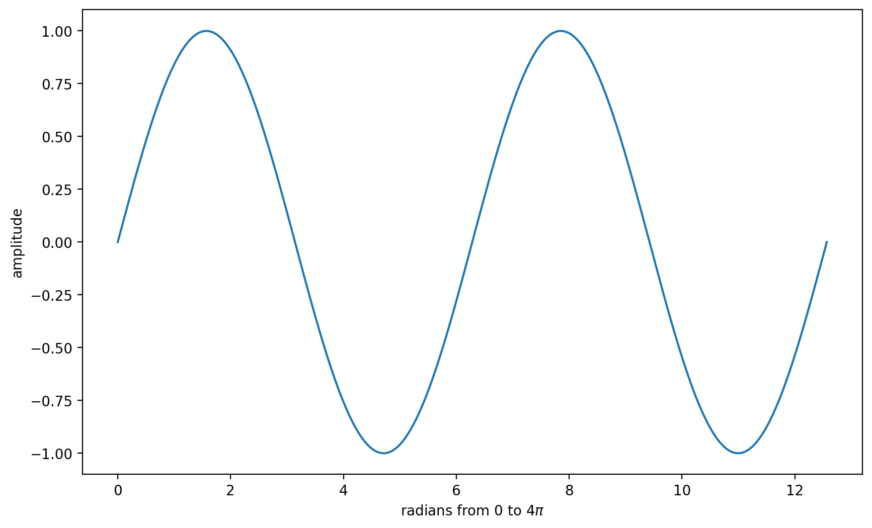
plt.plot(theta,np.sin(theta))
plt.xlabel('radians from 0 to $4\pi$')
plt.ylabel('amplitude');
<>:2: SyntaxWarning: invalid escape sequence '\p'
<>:2: SyntaxWarning: invalid escape sequence '\p'
/tmp/ipykernel_7717/2475386458.py:2: SyntaxWarning: invalid escape sequence '\p'
  plt.xlabel('radians from 0 to $4\pi$')
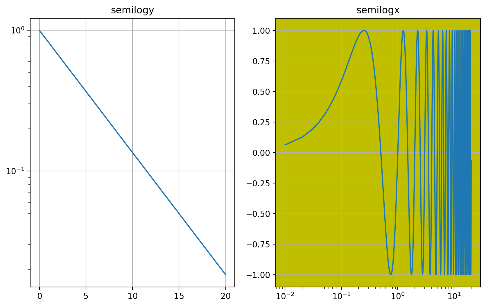
t = np.arange(0.01, 20.0, 0.01)

plt.subplot(121)
plt.semilogy(t, np.exp(-t/5.0))
plt.title('semilogy')
plt.grid(True)

plt.subplot(122,fc='y')
plt.semilogx(t, np.sin(2*np.pi*t))
plt.title('semilogx')
plt.grid(True)
Plot Grid and Save to File#
theta = np.linspace(0,2*np.pi,100)
plt.plot(np.cos(theta),np.sin(theta))
plt.grid();
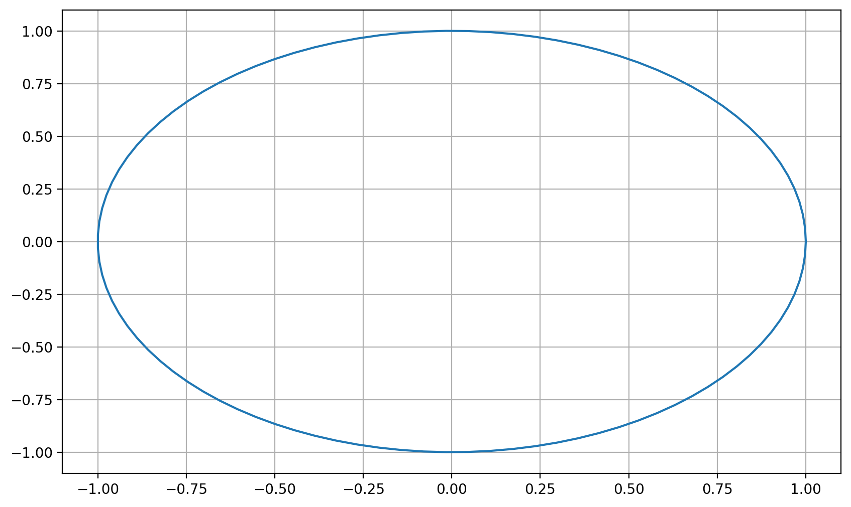
plt.savefig('circle.png');
%ls *.png
circle.png logo.png
<Figure size 1000x600 with 0 Axes>
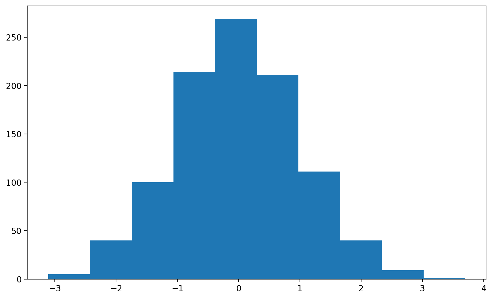
Histogram#
from numpy.random import randn
plt.hist(randn(1000));
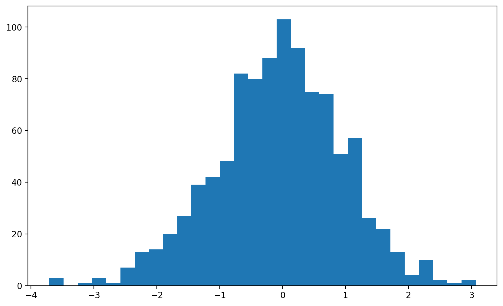
Change the number of bins and supress display of returned array with ;
plt.hist(randn(1000), 30);
Contour Plot#
x = y = np.arange(-2.0*np.pi, 2.0*np.pi+0.01, 0.01)
X, Y = np.meshgrid(x, y)
Z = np.sin(X)*np.cos(Y)

plt.contourf(X, Y, Z,cmap=plt.cm.hot);
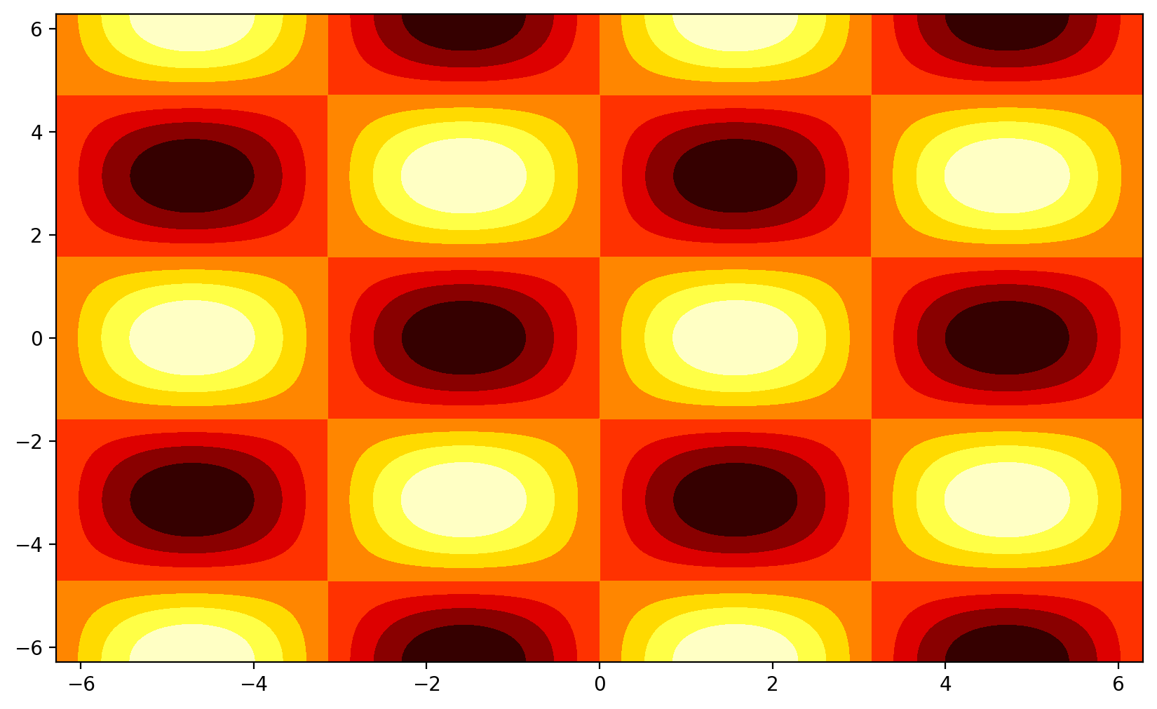
Image Display#
img = plt.imread("https://hackage.haskell.org/package/JuicyPixels-extra-0.1.0/src/data-examples/lenna.png")
plt.imshow(img)
---------------------------------------------------------------------------
ValueError                                Traceback (most recent call last)
Cell In[20], line 1
----> 1 img = plt.imread("https://hackage.haskell.org/package/JuicyPixels-extra-0.1.0/src/data-examples/lenna.png")
      2 plt.imshow(img)

File ~/miniconda3/envs/runenv/lib/python3.13/site-packages/matplotlib/pyplot.py:2615, in imread(fname, format)
   2611 @_copy_docstring_and_deprecators(matplotlib.image.imread)
   2612 def imread(
   2613         fname: str | pathlib.Path | BinaryIO, format: str | None = None
   2614 ) -> np.ndarray:
-> 2615     return matplotlib.image.imread(fname, format)

File ~/miniconda3/envs/runenv/lib/python3.13/site-packages/matplotlib/image.py:1515, in imread(fname, format)
   1511 img_open = (
   1512     PIL.PngImagePlugin.PngImageFile if ext == 'png' else PIL.Image.open)
   1513 if isinstance(fname, str) and len(parse.urlparse(fname).scheme) > 1:
   1514     # Pillow doesn't handle URLs directly.
-> 1515     raise ValueError(
   1516         "Please open the URL for reading and pass the "
   1517         "result to Pillow, e.g. with "
   1518         "``np.array(PIL.Image.open(urllib.request.urlopen(url)))``."
   1519         )
   1520 with img_open(fname) as image:
   1521     return (_pil_png_to_float_array(image)
   1522             if isinstance(image, PIL.PngImagePlugin.PngImageFile) else
   1523             pil_to_array(image))

ValueError: Please open the URL for reading and pass the result to Pillow, e.g. with ``np.array(PIL.Image.open(urllib.request.urlopen(url)))``.
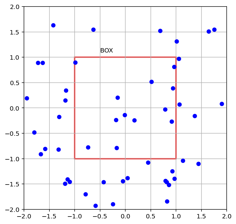
figure and axis#
Best method to create a plot with many components
fig = plt.figure()
axis = fig.add_subplot(111, aspect='equal',
                     xlim=(-2, 2), ylim=(-2, 2))

state = -0.5 + np.random.random((50, 4))
state[:, :2] *= 3.9
bounds = [-1, 1, -1, 1]

particles = axis.plot(state[:,0], state[:,1], 'bo', ms=6)
rect = plt.Rectangle(bounds[::2],
                     bounds[1] - bounds[0],
                     bounds[3] - bounds[2],
                     ec='r', lw=2, fc='none')
axis.grid()
axis.add_patch(rect)
axis.text(-0.5,1.1,"BOX")
Text(-0.5, 1.1, 'BOX')
Exercises#
Recreate the image my_plots.png using the delicate_arch.png file in images directory.
Alternatives#
bqplot : Jupyter Notebooks, Interactive.
seaborn : Statistics build on top of matplotlib.
toyplot : Nice graphes.
bokeh : Interactive and Server mode.
pygal : Charting
Altair : Data science (js backend)
plot.ly : Data science and interactive
Mayavi: 3D
YT: Astrophysics (volume rendering, contours, particles).
VisIt: Powerful, easy to use but heavy.
Paraview: The most-used visualization application. Need high learning effort.
PyVista: 3D plotting and mesh analysis through a streamlined interface for the Visualization Toolkit (VTK)
Yellowbrick : Yellowbrick: Machine Learning Visualization
scikit-plot : Plot sklearn metrics
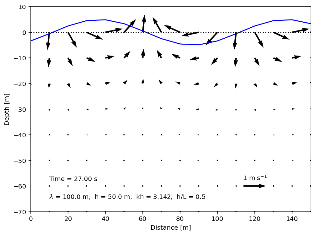
#example from Filipe Fernandes
#http://nbviewer.jupyter.org/gist/ocefpaf/9730c697819e91b99f1d694983e39a8f
import numpy as np
import matplotlib.pyplot as plt
from matplotlib import animation

g = 9.81
denw = 1025.0  # Seawater density [kg/m**3].
sig = 7.3e-2  # Surface tension [N/m].
a = 1.0  # Wave amplitude [m].

L, h = 100.0, 50.0  # Wave height and water column depth.
k = 2 * np.pi / L
omega = np.sqrt((g * k + (sig / denw) * (k**3)) * np.tanh(k * h))
T = 2 * np.pi / omega
c = np.sqrt((g / k + (sig / denw) * k) * np.tanh(k * h))

# We'll solve the wave velocities in the `x` and `z` directions.
x, z = np.meshgrid(np.arange(0, 160, 10), np.arange(0, -80, -10),)
u, w = np.zeros_like(x), np.zeros_like(z)


def compute_vel(phase):
    u = a * omega * (np.cosh(k * (z+h)) / np.sinh(k*h)) * np.cos(k * x - phase)
    w = a * omega * (np.sinh(k * (z+h)) / np.sinh(k*h)) * np.sin(k * x - phase)
    mask = -z > h
    u[mask] = 0.0
    w[mask] = 0.0
    return u, w


def basic_animation(frames=91, interval=30, dt=0.3):
    fig = plt.figure(figsize=(8, 6))
    ax = plt.axes(xlim=(0, 150), ylim=(-70, 10))

    # Animated.
    quiver = ax.quiver(x, z, u, w, units='inches', scale=2)
    ax.quiverkey(quiver, 120, -60, 1,
                 label=r'1 m s$^{-1}$',
                 coordinates='data')
    line, = ax.plot([], [], 'b')

    # Non-animated.
    ax.plot([0, 150], [0, 0], 'k:')
    ax.set_ylabel('Depth [m]')
    ax.set_xlabel('Distance [m]')
    text = (r'$\lambda$ = %s m;  h = %s m;  kh = %2.3f;  h/L = %s' %
            (L, h, k * h, h/L))
    ax.text(10, -65, text)
    time_step = ax.text(10, -58, '')
    line.set_data([], [])

    def init():
        return line, quiver, time_step

    def animate(i):
        time = i * dt
        phase = omega * time
        eta = a * np.cos(x[0] * k - phase)
        u, w = compute_vel(phase)
        quiver.set_UVC(u, w)
        line.set_data(x[0], 5 * eta)
        time_step.set_text('Time = {:.2f} s'.format(time))
        return line, quiver, time_step

    return animation.FuncAnimation(fig, animate, init_func=init,
                                   frames=frames, interval=interval)
from IPython.display import HTML

HTML(basic_animation(dt=0.3).to_jshtml())
References#
Simple examples with increasing difficulty https://matplotlib.org/examples/index.html
A matplotlib tutorial, part of the Lectures on Scientific Computing with Python by J.R. Johansson.
NumPy Beginner | SciPy 2016 Tutorial | Alexandre Chabot LeClerc
matplotlib tutorial by Nicolas Rougier from LORIA.
10 Useful Python Data Visualization Libraries for Any Discipline